EVALIE'S LITTLE GIRL ROOM:
A few pretty touches - a shadow box of her take home outfit, a little statue my mama bought her (they're the same ones she got me as a child!), a personalized jewelry box from our friend Katrina.
Main paint colour is BM Grey Mist...really more like an off white with a dab of greyish. It was the perfect colour to tone down the very yellow "vintage white" furniture yet not turn yellow itself with the purple accent stripe.
I painted the accent stripe using the new scallop frog tape - so cool! Made the name with decoupaging wooden letters. Lighting is from home depot. Furniture is by Munire (Savanah line - HIGHLY recommend this company for their customer service and excellent product!)
Lastly, the blessing we say to her every night. Got the idea from the book "The Blessing" by John Trent.
ANNELISE'S NURSERY:
Main paint colour is BM Revere Pewter with accent wall of BM Bridal Pink (requires a LOT LOT LOT of coats - and USE A PRIMER even if your paint is the best there is.)
Lace banner by my dear friend Alyssa. Photography by the amazing Jaydene Freud of Cradle Creations, Abbotsford. Lighting is again from Home Depot.
Curtains from Restoration Hardware. Vintage doilies were my crafty touch ;)
Furniture by Bratt Decor. Art work by Lindsay Letters (LOVE HER STUFF!) Used ikea metal bars on the wall to hang special handmade blankets (thanks Auntie Jenn!)
GUEST ROOM:
Stuck with a simple black and white damask scheme (from years ago!) and brought in a touch of green. Walls are "Folly" by Behr. Curtains are...WALMART of all places! Lighting is from Tiffany Lighting through Joss and Main online.
If you come to visit, you get your own bathroom! I'm thinking about painting the end tables in a crisp fresh white instead of the creamy colour that they are.
FRONT SITTING ROOM:
We wanted this room to be a bit more formal and elegant, but also not too heavy on furniture so that our formal dining room can expand here when needed. We still wanted it warm and inviting, so we added the blanket ladder in the corner.
The wallpaper is a stock line at our local Benjamin Moore store, so it didn't take nine months to custom order (like our last house!) Google "Atlantic Damask Silver Modern Damask" and you'll find it in other neutral colours too. We love how it's a modern take on a traditional pattern.
We moved the big bathroom mirror from our upstairs en suite remodel to the entry way. We also painted the inside of our front door black to dress it up.
Painting, lamps, couches, ottoman, end tables: homesense. Coffee table, black rug: ikea. Decided to use aqua as the accent colour through pillows, curtains, and lampshades, but can easily change this up as desired :)
LAUNDRY ROOM:
This mudroom off the garage was once just a couple machines on the floor and an industrial sink. NOW IT'S DREAMY! I always get laundry done quickly and easily (the folding the putting away is another story lol!) The drawers are sturdy enough that they act as a stand for my baskets; and the lower ones are deep enough to actually store laundry baskets full!
Haven't decided what to do here yet - it's a low shelf of hooks for Evalie to hang up her coats on her own for now. I am thinking eventually I would like to find a really cool bulletin board for school stuff to gather when the time comes.
LIVING ROOM:
Some people call this the Family Room, but to me it's where all the living takes place so I call it the living room...it's a bit confusing for some (like my husband, for example lol)! We went with a darker, warmer paint colour since we have tons and tons of natural south facing light along this great room. It's BM Rockport Grey. I think it really keeps everything warm, but modern :)
Two sitting chairs and two couches (sofas from Urban Barn) makes for lots of room for friends to chat! Yet, there is still room for the kiddos to play (that ottoman is full of toys!) and there is a baby swing, play mat, and exersaucer usually here too ;) Curtains are from Target - love the ombre!
Big fireplaces are hard to decorate without televisions! But, I think this painting from Bouclair Home did the trick ;)
Love this office nook where we can one day keep an eye on what our girls are looking at on the computer. Notice the messy papers everywhere...tis wha tis.
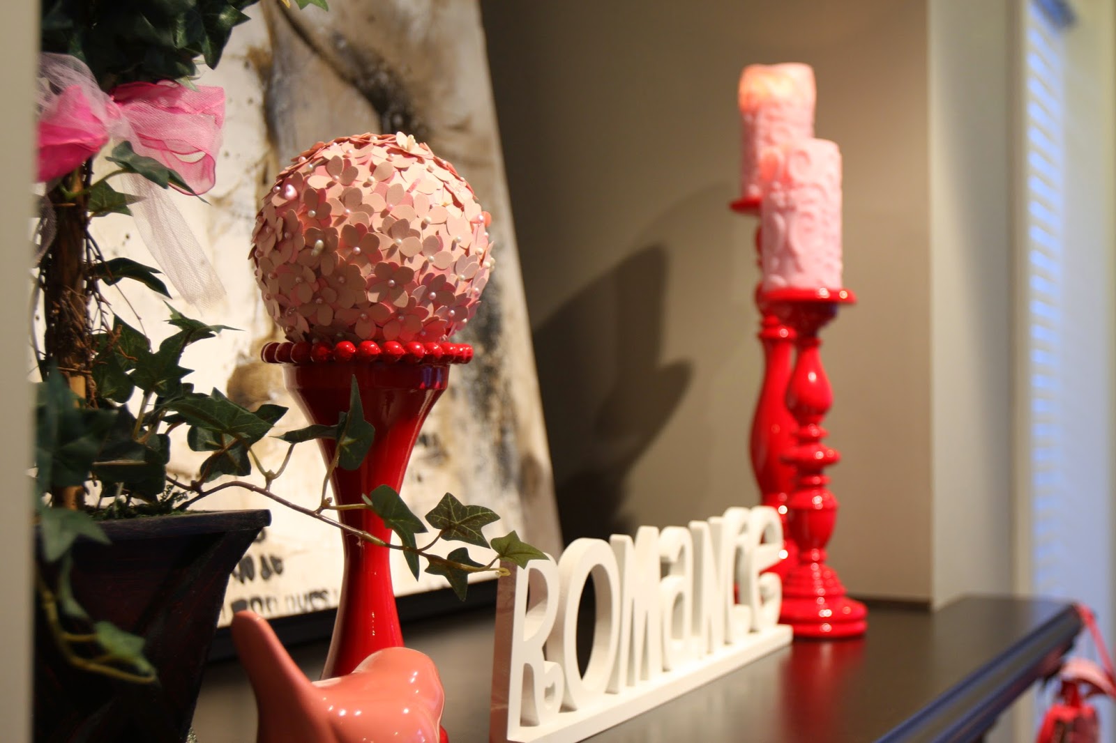
A couple fun Heart Day decorations ;) The heart banner is on its last leg and might have to retire after this year...the paper just keeps getting more and more warped. OH, and if you ever decide to do one of these paper flower styrofoam ball things, two pieces of advice: only use the Martha Stewart four-petal flower punch and stick with monochromatic!
Love our awesome rug because it pulls in all the neutrals and adds some pattern to the room. It was an investment from our carpet store (Atlanta Flooring in Mission BC) and won't stain (so they say!)
Some art I made from cutting old hymns into heart shapes and modge podging - the gold isn't the best with this paint colour, but oh well! It's special anyway.
Another spot where I have toys available - under the couch console table...see how pretty it all looks when I cut that bottom part off? Haha! Oh what pictures can hide and show!
Thanks for looking - hope you can come for a visit IRL soon!


No comments:
Post a Comment